

Redesigning AVAAZ

The global web movement bringing people to decision-making everywhere.
What is AVAAZ ?
Avaaz is a global online movement that empowers people to take action on urgent social, political, and environmental issues.
Through petitions, campaigns, and advocacy efforts, Avaaz mobilizes millions of members worldwide to drive meaningful change on topics like climate justice, human rights, and democracy.

Main objectives
Avaaz aims to mobilize global action and empower individuals worldwide to take collective action on urgent social, political, and environmental issues.
It also aims to increase engagement & advocacy by driving participation through petitions, campaigns, and fundraising efforts to influence policy decisions and global change.

Avaaz business goals

Avaaz main business goals are to expand reach & awareness and grow the Avaaz community by making activism accessible and increasing awareness of critical issues.
By enhancing user experience it will provide a seamless, intuitive platform that encourages user engagement, donations, and social sharing. By using data-driven strategies and technology to maximize impact, it will optimize campaign effectiveness and advocacy efforts.
Avaaz key opportunities for Improvement
I simplified the website layout, improved search functionality, and introduced category-based filtering for better navigation and UX.
I implemented real-time petition tracking to enhance user engagement and retention. Then, I prioritized a mobile-first approach, ensuring a seamless petition-signing and donation flow.
I provided clear impact reports to enhance transparency in fundraising and introduced forums and localized activism features to strengthen community participation.

Research Goals
I analyzed user behavior to understand how they interact with petitions, donations, and campaigns. Identified key pain points related to navigation, readability, and accessibility.
Then, I optimized CTAs to improve conversion rates for petitions, donations, and campaign sharing. I enhanced the mobile experience by creating a seamless and user-friendly interface.
I strengthened community engagement by implementing social sharing, and real-time updates. I simplified and improved the donation flow to optimize fundraising efforts.

Research methodology
I conducted qualitative interviews with Avaaz users to understand their motivations, challenges, and expectations.
Then I collected quantitative insights on user behavior, engagement levels, and pain points.

Avaaz Redesign – Key Insights
I simplified and categorized the UI to address navigation issues, improving search and reducing overwhelming content and provided a fully responsive design. I added progress tracking and sharing prompts to keep users engaged beyond signing petitions.
I optimized the mobile UX for smoother petition signing and donations. I enhanced transparency by providing clear donation impact reports and success stories. I introduced forums to foster community engagement and support local activism.

Information architecture
The Avaaz information architecture is designed for clarity and engagement, with six main sections: Home, About Us, What We Do, Media, Victories, and Contact Us. Content is logically structured to highlight Avaaz’s mission, campaigns, and successes, ensuring users can easily find information, take action, and stay informed.

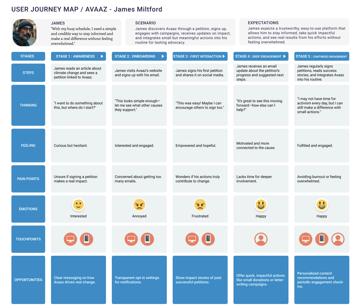
User journey map
James' user journey with Avaaz begins with discovering a petition that sparks his interest. He quickly signs up, engages with campaigns, and shares petitions, expecting a seamless and impactful experience.
As he receives updates on progress, he feels more connected and motivated to take further action. Over time, Avaaz becomes part of his routine, allowing him to stay informed and contribute meaningfully without feeling overwhelmed.
Sketch to wireframe
I began designing low-fidelity sketches to explore layout ideas and user flows quickly. I refined them into wireframes, focusing on structure, hierarchy, and navigation. Iterative testing ensured clarity and usability, laying the foundation for an intuitive and engaging design before moving to high-fidelity prototypes.


Sketch to high fidelity
I started with sketches, to explore layout ideas and user flows before refining them into wireframes for structure and usability.
Through iterative testing, wireframes evolved into high-fidelity designs, incorporating visual elements, branding, and interactive details to enhance clarity, engagement, and accessibility.

From high fidelity to prototype
I transformed high-fidelity designs into an interactive prototype, allowing users to experience real navigation, transitions, and interactions. Usability testing helped refine flows, responsiveness, and engagement, ensuring a seamless and intuitive user experience before moving to development.

